
html流星雨代码如何实现


这篇文章主要讲解了“html流星雨代码如何实现”,文中的讲解内容简单清晰,易于学习与理解,下面请大家跟着小编的思路慢慢深入,一起来研究和学习“html流星雨代码如何实现”吧!
html流星雨代码的实现方法:1、创建一个HTML示例文件;2、添加HTML代码为“<div class="container"><div class="line" style="--color:#ec3e27;--x:3;--z:3;--d:1;"></div>...”;3、通过设置css样式为“.container {position: relative...}”来实现。
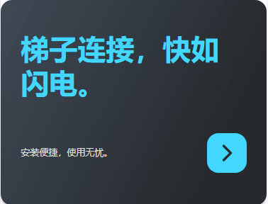
效果图(流星带颜色的,截图没显示):

代码如下:
html代码:
<!DOCTYPE html>
<html>
<head>
<meta charset="utf-8">
<title>漫天流星雨</title>
<link rel="stylesheet" type="text/css" href="index.css"/>
</head>
<body>
<div class="channel">
<!--嗯,这行下面的字可以改变-->
一起来看流星雨吧!   -- (●ˇ∀ˇ●)
</div>
<div class="container">
<div class="line" style="--color:#ec3e27;--x:3;--z:3;--d:1;"></div>
<div class="line" style="--color:#fff;--x:3;--z:2;--d:2;"></div>
<div class="line" style="--color:#fff;--x:4;--z:1;--d:3;"></div>
<div class="line" style="--color:#fd79a8;--x:4;--z:0;--d:1;"></div>
<div class="line" style="--color:#fff;--x:6;--z:-1;--d:2;"></div>
<div class="line" style="--color:#0984e3;--x:6;--z:-2;--d:3;"></div>
<div class="line" style="--color:#fff;--x:8;--z:-3;--d:1;"></div>
<div class="line" style="--color:#fff;--x:10;--z:-4;--d:2;"></div>
<div class="line" style="--color:#fff;--x:12;--z:-5;--d:3;"></div>
<div class="line" style="--color:#fff;--x:14;--z:-6;--d:1;"></div>
<div class="line" style="--color:#fff;--x:16;--z:-7;--d:2;"></div>
<div class="line" style="--color:#fff;--x:18;--z:-8;--d:3;"></div>
<div class="line" style="--color:#e056fd;--x:20;--z:-9;--d:1;"></div>
</div>
</body>
</html>
css代码:
:root {
--background-color: #2c3e50;
--border-color: #7591AD;
--text-color: #34495e;
--color1: #ec3e27;
--color2: #fd79a8;
--color3: #0984e3;
--color4: #00b894;
--color5: #fdcb6e;
--color6: #e056fd;
--color7: #F97F51;
--color8: #BDC581;
}
* {
margin: 0;
padding: 0;
}
html {
font-size: 14px;
}
body {
width: 100vw;
height: 100vh;
background-color: var(--background-color);
display: flex;
justify-content: center;
align-items: center;
/* font-family: 'Times New Roman', Times, serif; */
}
.channel {
position: absolute;
width: 80%;
text-align: center;
top: 50%;
left: 50%;
transform: translate(-50%, -200px);
font-size: 30px;
font-weight: bold;
color: #fff;
z-index: 999;
}
.container {
position: relative;
width: 100vw;
height: 100vh;
background-color: #000;
overflow: hidden;
display: flex;
justify-content: center;
align-items: center;
perspective: 800px;
/* perspective-origin: left bottom; */
transform-style: preserve-3d;
}
.line {
position: absolute;
width: 200px;
height: 3px;
border-radius: 3px;
/* background-color: #fff; */
background-image: linear-gradient(to right, var(--color), #ffffff50, transparent);
animation: down 1s linear infinite both;
animation-delay: calc(var(--d) * 0.3s);
}
.line::before,
.line::after {
position: absolute;
content: "";
width: inherit;
height: inherit;
background-image: inherit;
}
.line::before {
filter: blur(5px);
}
.line::after {
filter: blur(10px);
}
@keyframes down {
0% {
transform: translateY(calc(var(--z) * 60px))
translateZ(calc(var(--z) * 100px))
rotate(-45deg)
translateX(calc(var(--x) * 100px));
}
100% {
transform: translateY(calc(var(--z) * 60px))
translateZ(calc(var(--z) * 100px))
rotate(-45deg)
translateX(calc(var(--x) * -100px));
}
}
.channel{
background: linear-gradient(to right,red,blue);
-webkit-background-clip: text;
color: transparent;
}
感谢各位的阅读,以上就是“html流星雨代码如何实现”的内容了,经过本文的学习后,相信大家对html流星雨代码如何实现这一问题有了更深刻的体会,具体使用情况还需要大家实践验证。这里是蜗牛博客,小编将为大家推送更多相关知识点的文章,欢迎关注!
免责声明:本站发布的内容(图片、视频和文字)以原创、转载和分享为主,文章观点不代表本网站立场,如果涉及侵权请联系站长邮箱:niceseo99@gmail.com进行举报,并提供相关证据,一经查实,将立刻删除涉嫌侵权内容。


评论